Design
Designing story and post templates that people can read
Safe zones, text size, contrast and room for stickers: how to design story and post templates that work every time you reuse them.
Borders, light leaks and rounded corners look current when they have a job and stay consistent. Simple rules for each, with settings to start from.
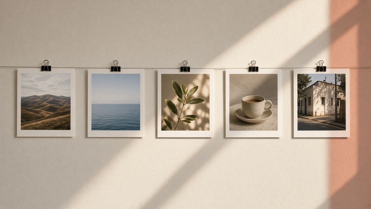
Frames, borders and overlays have a reputation problem. Many people remember thick glossy borders, heavy light leaks on every photo and corners rounded for no reason. Those looks dated quickly because they were added to everything, in the strongest setting, without a reason.
The same tools look current when they do a job. A thin white border can make a feed calm and consistent. An instant-print frame can turn a carousel into a small photo album. A soft light leak can make a winter photo feel warm. A rounded corner can make a product shot look like a card. The difference is restraint and consistency, not the effect itself.
This post gives you simple rules for each of the four finishing touches in our editor: frames, overlays, rounded corners and the blurred frame. The numbers below are our own rules of thumb, not Instagram rules; adjust them to your taste.
The most useful rule is also the simplest: choose one finishing touch per photo. A frame plus an overlay plus rounded corners plus a sticker is where the dated look begins. Pick the one that serves the post.
| Touch | What it does | Looks current when | Looks dated when |
|---|---|---|---|
| Frame or border | Adds space and an edge around the photo | Thin, in one color across a series | Thick, shiny, different on every post |
| Overlay | Blends light, texture or weather into the photo | Low opacity, matches the scene | Strong, on every photo, over faces |
| Rounded corners | Cuts the corners or the whole photo to a shape | Used for cards, stickers and product shots | Applied to every feed photo by habit |
| Blurred frame | Fits a photo of any shape into an Instagram shape | The photo really needs its whole width | The blur is busier than the photo |
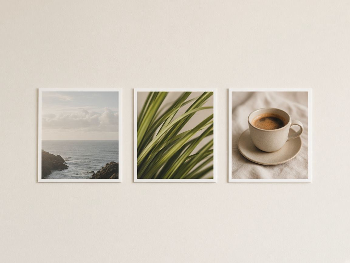
Our photo frames tool has 22 styles, from a plain Border and Double line to Instant print, Film strip, Torn paper, Gallery mat and Neon. Each one has a color and a thickness setting. A few choices make most of the difference:
Frames add space around the photo instead of covering it, so the framed image is larger than the original. If the post needs an exact Instagram shape, choose a preset such as 1080 × 1350 in the Size panel first, and the framed picture is fitted into it. Instagram keeps photos at their shape only between 1.91:1 and 3:4 and crops other shapes to fit (Instagram Help Center (opens in a new tab), checked November 2026).
Also keep in mind that the profile grid shows posts as cropped tiles, so the side edges of a frame may not show there. Our post on the 3:4 profile grid explains how the grid crops.
An overlay blends a second image into the photo. Our photo overlay tool draws 18 of them in the browser, including warm, pink and golden light leaks, bokeh, dust, scratches, paper, rain, snow and lens flare, and you can add your own image as a second overlay. The way the overlay mixes in depends on the blend mode: Screen, Multiply, Overlay, Soft light or Normal.
Overlays go wrong when they are too strong. These habits keep them natural:
If you also use a filter, choose it first and judge the overlay with the filter on. Our post on choosing a filter covers how strong a look should be.
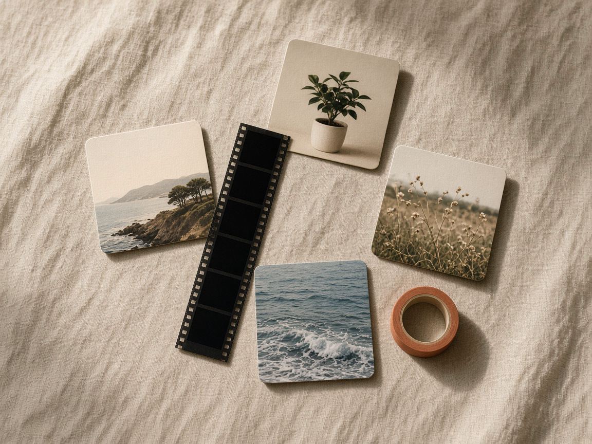
Rounded corners look modern on things that are cards in real life: product shots, menu items, tickets, slides, screenshots of a recipe card you designed. They also work for stickers you place on a story, and as a circle for profile photos and badges. They work less well on landscapes and portraits in the feed, where they mostly look like a filter applied by habit.
The round corners tool rounds by a percentage of the shorter side or by pixels, or cuts the image to a circle or a squircle. The corners can be transparent in PNG and WebP, or filled with a color. Feed posts do not show transparency, so for a rounded photo in the feed, choose a fill color on purpose: white for a clean grid, or a brand color so the photo sits on a colored card.
A tip for carousels: put rounded photos on a solid background color that repeats on every slide. The rounding then reads as a design choice rather than an accident, and the slides look like one set.
Sometimes a frame is not decoration but a fix. A wide panorama or a tall phone screenshot does not fit Instagram's feed shapes, and cropping would cut off what matters. The blurred background tool fits the whole photo into a shape such as 4:5 and fills the empty space with a blurred copy of the same photo, a solid color or a two-color gradient.
The blurred version looks best when the photo has calm colors; with a busy photo, a solid color taken from the picture is often cleaner. Our guide on posting a full photo without cropping compares the options, and the image sizes guide lists the exact pixel sizes.
Pick one post shape for the series, such as 4:5, so every framed photo has the same outline.
A thin border, a gallery mat, an instant print or rounded corners on a color. One, not all four.
Note the frame, color, thickness and opacity you used. The editor does not save settings between visits, so a short note keeps the series consistent.
Look at the exported image on a phone before you post. If you cannot see the border or the overlay, it is too subtle; if it is the first thing you notice, it is too strong.
We know of no Instagram rule against frames. What matters is that the photo stays easy to see on a small screen, so keep borders thin enough that the photo still fills most of the post.
Yes, the editor applies both. Keep at least one of them very subtle, otherwise the photo starts to look busy.
No. The editor runs in your browser, and the photo stays on your device.
Design
Safe zones, text size, contrast and room for stickers: how to design story and post templates that work every time you reuse them.
Design
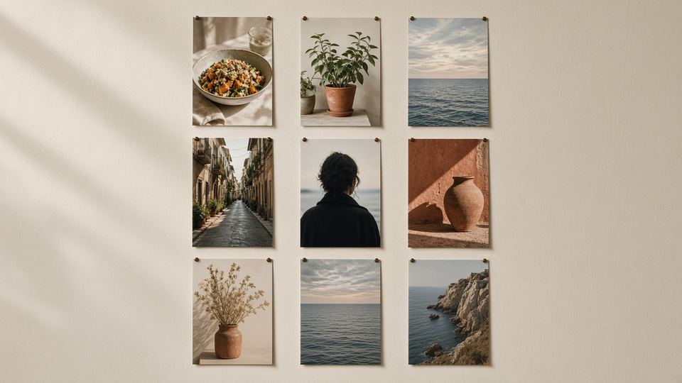
The profile grid switched to tall tiles in January 2025. What gets cropped, the size to post, and how to plan a grid that looks right.
Design
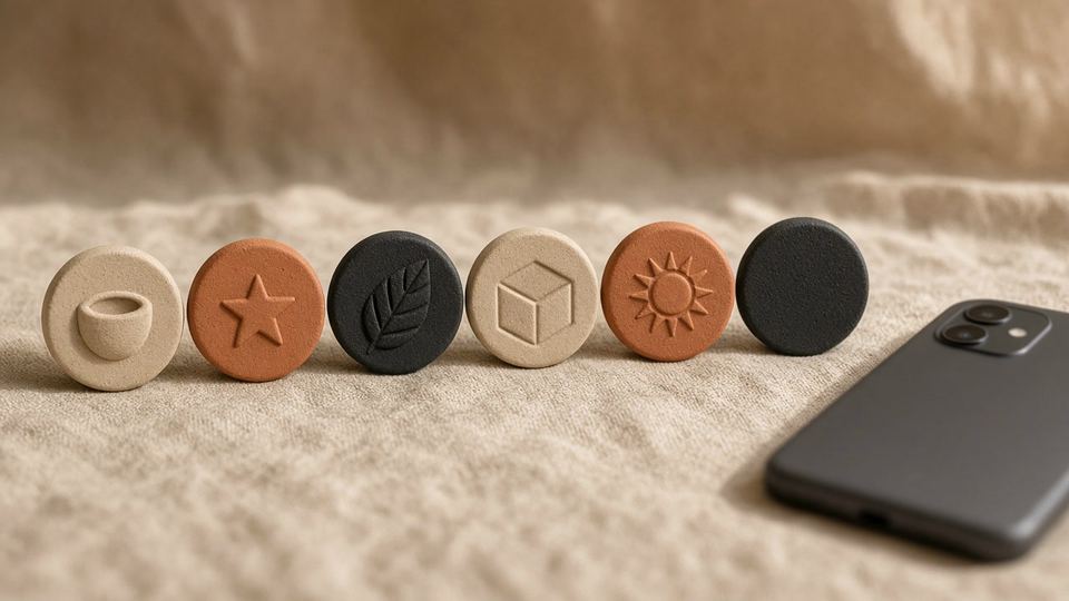
Icons, colors and names for highlight covers that look like one set and help visitors find what they came for.