Design
Frames, borders, overlays and rounded corners without looking dated
Thin borders, subtle light leaks and rounded corners that look current: simple rules for thickness, opacity, blend modes and a consistent style.
Where text is safe on a story, how big and how short it should be, and how to build a set of templates that looks consistent without looking repetitive.
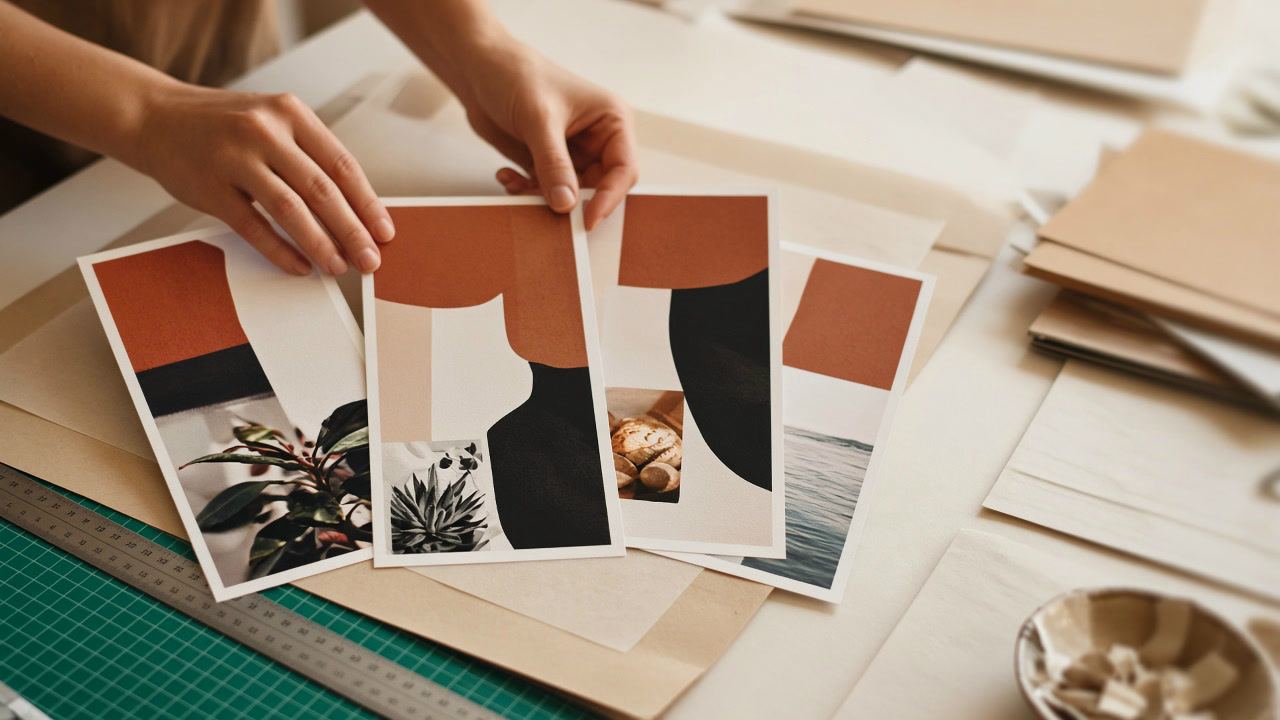
A template is a layout you design once and fill many times: the same positions for the headline, the photo and the small print, with new words and pictures each time. It saves you from starting with a blank canvas every week, and it makes your stories and posts recognizable before anyone reads the name at the top.
A template only helps if the layout itself is good, though. A beautiful design that puts the headline under Instagram's reply field, or white text on a pale photo, will repeat that mistake in every story you make with it. This post is about getting the layout right: where text is safe, how big it should be, how much of it to use, and how to keep a set consistent. The exact pixel sizes for every format are in our Instagram sizes guide; here we only use them.
Both are images with text on them, but they are seen in very different ways, and a layout that works for one often fails for the other.
| Story template | Post template | |
|---|---|---|
| Canvas | 1080 × 1920 (9:16), fills the phone screen | 1080 × 1350 (4:5) or 1080 × 1080 (1:1) |
| How long it is seen | A few seconds, then the next story starts unless the viewer holds the screen | As long as the viewer scrolls past or stops |
| What covers it | Profile name and progress bar at the top, reply field at the bottom, stickers you add in the app | Nothing in the feed; a cropped thumbnail on the profile grid |
| Best use | One short message, a question, a countdown, a link | Something worth saving: tips, quotes, announcements, carousel covers |
So a story template should be bold and brief, with its message in the middle of the screen. A post template can hold a little more, but it has to survive being shrunk to a small square on your profile grid, which is covered in our post on planning a grid that crops well.
Instagram draws its own interface over every story: the progress bar, your profile picture and name at the top, and the reply field at the bottom. Text placed there is partly hidden. Instagram does not publish safe margins for organic stories, but Meta does for story ads: leave roughly 14% of the top, 35% of the bottom and 6% on each side free of text, logos and other key elements (Meta Ads Guide (opens in a new tab), checked November 2026).
On a 1080 × 1920 story, that works out to about 269 pixels at the top, 672 pixels at the bottom and 65 pixels on each side, which leaves a safe box from 65 to 1,015 pixels across and from 269 to 1,248 pixels down. Ads need the large bottom margin because of their call-to-action button. Organic stories have less on screen, so our own story templates use a looser rule: important text stays between 250 and 1,600 pixels from the top, which keeps the bottom 320 pixels clear for the reply field.
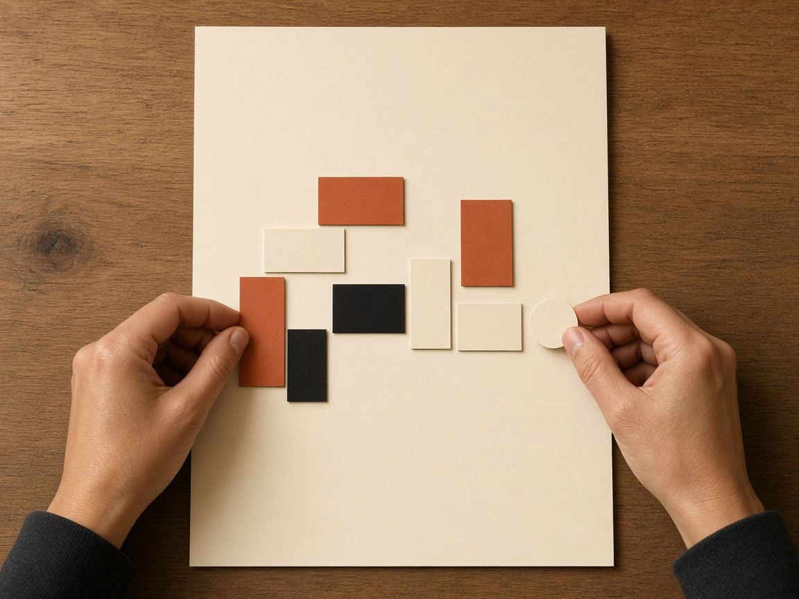
Most template problems are text problems. Three things decide whether a story is read or skipped: how much text there is, how big it is, and how well it stands out from the background.
One headline and one supporting line is enough for most stories. As a rule of thumb, stay under about 20 words per story; if you need more, split the message over two or three stories or move it into a post. Put details such as prices, dates and links in the caption, a sticker or the next slide.
A 1080-pixel-wide story is shrunk to the width of the phone. On a phone about 390 points wide, everything appears at roughly a third of its pixel size. Our rule of thumb from that arithmetic: body text at least 44 pixels high on the canvas, which comes out at about 16 points on screen, the size of ordinary app text, and headlines at 90 pixels or more. Very thin fonts need to be larger still.
The web accessibility standard WCAG asks for a contrast ratio of at least 4.5:1 for normal text and 3:1 for large text (W3C (opens in a new tab), checked November 2026). Instagram does not require it, but it is a useful target, because stories are read outdoors, at low brightness and by people with weaker eyesight. Text over a photo rarely reaches it by itself. Three fixes work well:
Question boxes, polls, countdowns, link stickers and mentions are added in the Instagram app after you upload the image; an image made in any editor, ours included, cannot contain a working sticker. A good interactive template therefore has a planned empty area, usually in the middle third, where the sticker will go, and a headline above it that tells people what to do: "Ask me anything about sourdough", "Which one should we make next?"
Our story templates include designs built around this, such as question and poll backgrounds, a countdown, a link-in-bio story and a weekly schedule. When you design your own, place a rough rectangle where the sticker will sit while you work, so that nothing important ends up under it.
Consistency comes from a few fixed decisions; variety comes from everything else. Decide the fixed parts once and write them down:
Within that frame, change the photo, the main color of the background and the words. Followers recognize the series and still see something new each time.
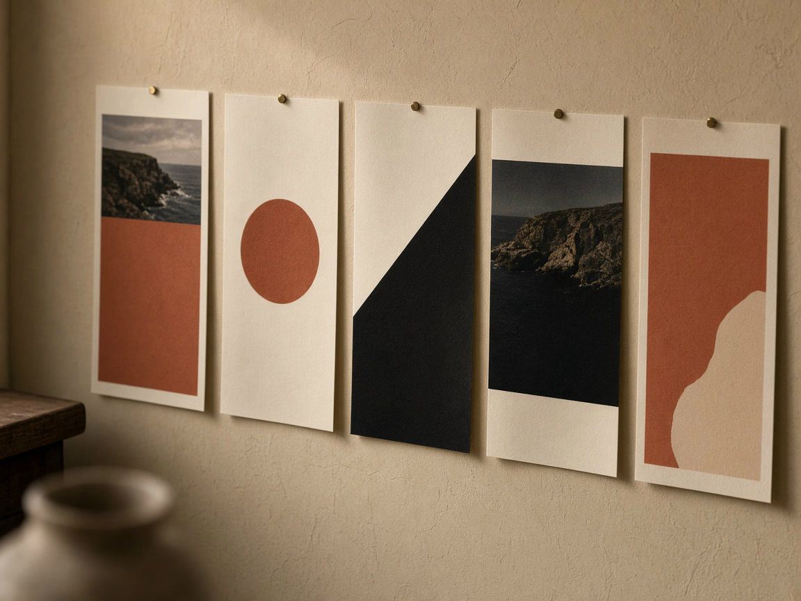
Extend the same system to the rest of your profile. Carousel covers, inner slides and last slides from our post templates can share the palette of your stories, and highlight covers made with the highlight cover maker in the same colors tie the stories you keep to the profile. Our post on designing highlight covers shows how to plan that set.
If the photo you want to use has the wrong shape, fit it into the frame with a border or blurred background instead of cropping away the subject; our guide to posting a full photo without cropping shows three ways. Every story and post design we offer is also in one place in the template gallery.
Use the same colors and fonts, but not the same layout. A story is 9:16 and is covered at the top and bottom; a post is 4:5 or 1:1 and is cropped on the grid. Make one version of each.
PNG keeps the edges of text and flat colors crisp, so it is the better choice for text-heavy designs. JPG gives smaller files for photo-heavy designs. Instagram compresses every upload either way.
As a rule of thumb, one headline and one short line, about 20 words in total. If you need more, split it over several stories or put it in a post.
No. Interactive stickers are added in the Instagram app after you upload the image. Design an empty space for them and add them before you share.
Design
Thin borders, subtle light leaks and rounded corners that look current: simple rules for thickness, opacity, blend modes and a consistent style.
Design
The profile grid switched to tall tiles in January 2025. What gets cropped, the size to post, and how to plan a grid that looks right.

Design
Icons, colors and names for highlight covers that look like one set and help visitors find what they came for.