Design
Frames, borders, overlays and rounded corners without looking dated
Thin borders, subtle light leaks and rounded corners that look current: simple rules for thickness, opacity, blend modes and a consistent style.
Plan the highlights, choose icons and colors that read in a small circle, keep the names short, and make the whole set in one go.
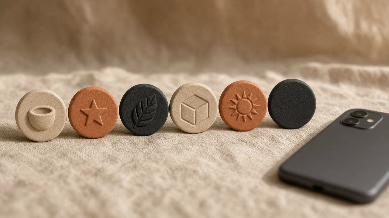
Highlights are the row of circles between the bio and the grid. Each one collects stories that stay on your profile after the usual 24 hours: a menu, prices, reviews, a trip, answers to the questions people keep asking. For a visitor who has never seen your account, that row is a table of contents. Clear covers tell them in a second where to tap.
When you create a highlight, Instagram lets you pick the stories, then choose a cover and a name with Edit cover (Instagram Help Center (opens in a new tab), checked November 2026). Without a custom cover, the circle shows a crop of one of the stories, which usually means a random detail of a photo. A set of matching covers replaces that with something calm and readable.
This post is about designing the set: which highlights to make, which icons, which colors and which names. For the sizes and the tool itself, see the highlight cover maker and our image size guide.
Start with a list, not with colors. Write down the questions new visitors ask you most often, and turn each one into a highlight. Only the first few circles are visible without swiping sideways, so the most important highlight goes first.
| Account | Highlight ideas |
|---|---|
| Café or restaurant | Menu, Hours, Events, Reviews, Team |
| Online shop | New, Shipping, Sizes, Reviews, Care |
| Photographer | Portfolio, Prices, Process, Clients, FAQ |
| Fitness coach | Programs, Results, Recipes, Q&A, About |
| Travel creator | One highlight per country or trip, plus Tips and Gear |
| Personal account | Trips, Friends, Pets, Food, a hobby |
As a rule of thumb, three to seven highlights are enough for most accounts; past that, people stop reading. Our profile audit counts three or more highlights as a pass, which is also our own rough guide rather than an Instagram rule. Merge small topics ("Shipping" and "Returns" can be one highlight) and drop the ones you never update.
A highlight circle on a phone is small, roughly the size of a fingertip. Detail disappears; shape is all that is left. That gives a few practical rules:
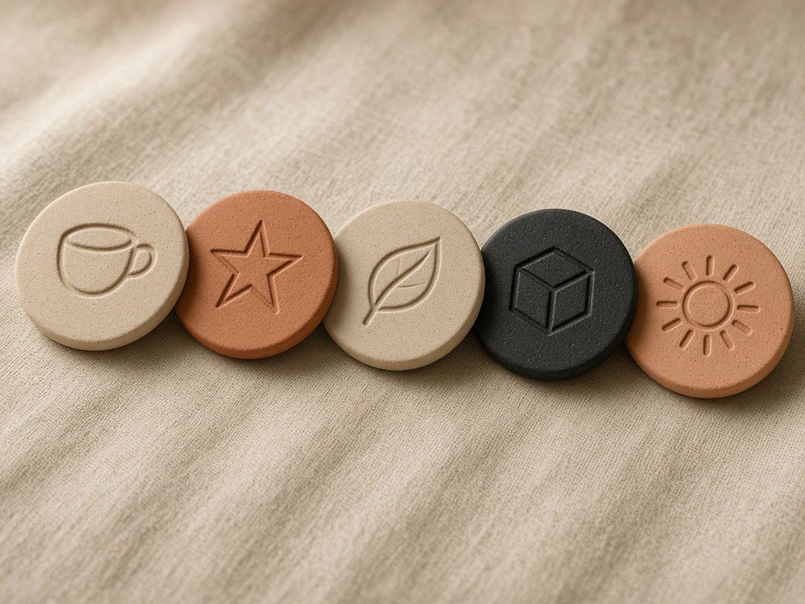
A set looks consistent when the background changes less than the icon. Pick one background treatment for every cover and change only the icon. The common approaches:
| Style | How it looks | Fits |
|---|---|---|
| One brand color, white icons | Clean and strong, easy to recognize | Shops, services, brands with a clear color |
| Soft neutral (sand, cream, stone) with dark icons | Calm, editorial | Lifestyle, beauty, home, cafés |
| Two-color gradient | Lively without being busy | Creators whose posts share a palette |
| Texture such as linen, paper or marble | Tactile and warm | Handmade, interiors, weddings |
| A darkened photo behind a white icon | Rich, but needs care to stay readable | Travel and food |
Check contrast before you export. The icon must stand out clearly from the background, which rules out light gray on beige and dark blue on black. Remember also that people see your profile in Instagram's light and dark themes. A cover with its own solid background looks the same in both; a transparent or very light one can disappear against a white screen.
To tie the covers to the rest of the profile, reuse two or three colors that already appear in your posts. If you design posts with templates, use the same palette there, so the grid and the highlights look like they belong together.
Instagram writes the highlight name under each cover in small type, and long names are cut off. Short, plain names work best:
Our post on auditing your profile covers how highlights work together with the bio, the link and the grid.
Open the highlight cover maker and choose one of the 16 ready-made styles, or set the background yourself: solid color, gradient, one of 8 textures or your own photo.
Choose an icon from the 183 line icons and set its color, size and line thickness. Add a ring if you like. Watch the preview as a row of highlights, not only as a single circle.
Use "Make a set" to select up to 20 icons. They are exported in the same style as one ZIP file, one PNG per icon, numbered in the order you selected them.
Press and hold a highlight on your profile and choose Edit highlight (Instagram Help Center (opens in a new tab), checked November 2026), then change the cover and pick the image from your gallery.
The maker exports two sizes: a 320 × 320 square to choose directly as the cover, or a 1080 × 1920 story frame with the icon centered, if you prefer to post the cover as a story first. Everything runs in your browser; your photos are not uploaded. To design the stories that go inside the highlights in the same look, use the story templates; the template gallery shows covers, story and post templates together. Our post on story template design has more on layout and readable text.
Instagram does not publish an official size. A square of 320 × 320 pixels or larger works when you pick the cover from your gallery, and a 1080 × 1920 story frame with the icon in the center works if you post the cover as a story first.
No. When you edit a highlight's cover, you can choose an image from your phone's gallery. Posting it as a story first is just another way to do it.
There is no official number. Three to seven covers the main topics for most accounts; that range is our rule of thumb, not an Instagram recommendation.
It helps people connect the profile with the rest of your posts. One or two brand colors with a neutral background is usually enough.
Design
Thin borders, subtle light leaks and rounded corners that look current: simple rules for thickness, opacity, blend modes and a consistent style.
Design
Safe zones, text size, contrast and room for stickers: how to design story and post templates that work every time you reuse them.
Design
The profile grid switched to tall tiles in January 2025. What gets cropped, the size to post, and how to plan a grid that looks right.