Design
Frames, borders, overlays and rounded corners without looking dated
Thin borders, subtle light leaks and rounded corners that look current: simple rules for thickness, opacity, blend modes and a consistent style.
What the tall grid tiles cut from squares, 4:5 posts and Reels, which size to post from now on, and how to repair a grid you planned for squares.
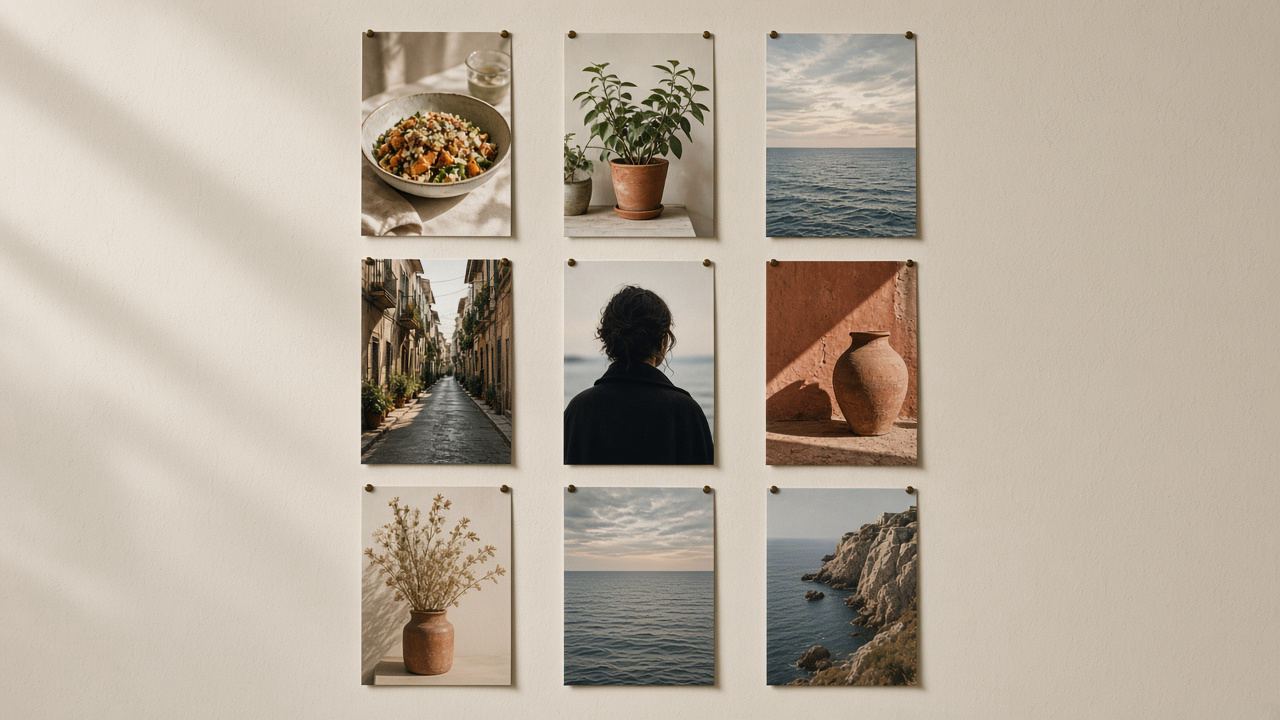
For most of Instagram's history, the profile grid showed every post as a square. In January 2025 that changed: profile grids switched to tall rectangles. Instagram's head Adam Mosseri announced the rollout in a story on January 17, 2025, explaining that most photos and videos uploaded to Instagram are vertical and that cropping them to squares cut off too much (The Verge (opens in a new tab), checked November 2026).
Instagram has not published an exact ratio for the grid tiles. Design and press sources measure them at 3:4, three units wide for every four tall, and that matches the tallest shape Instagram now keeps for feed photos. The Help Center says photos keep their resolution when the aspect ratio is between 1.91:1 and 3:4, which at 1080 pixels wide means a height between 566 and 1440 pixels (Instagram Help Center (opens in a new tab), checked November 2026). So a 1080×1440 photo is the one shape that shows in full both in the feed and on the profile.
The change only affects the thumbnails on your profile. When someone taps a post, they still see it in the shape you uploaded. But the grid is what a new visitor sees first, and a grid of awkwardly cropped thumbnails makes a careful account look careless.
By default the grid shows the middle part of a post, cut to the tall tile. How much disappears depends on the shape you uploaded. The numbers below are simple geometry for a centered crop at 1080 pixels wide:
| Post shape | Size | What the tile hides |
|---|---|---|
| 3:4 portrait | 1080 × 1440 | Nothing |
| 4:5 portrait | 1080 × 1350 | About 34 px on each side, roughly 6% of the width |
| 1:1 square | 1080 × 1080 | 135 px on each side, a quarter of the width |
| 1.91:1 landscape | 1080 × 566 | About 328 px on each side, more than half of the width |
| 9:16 Reel cover | 1080 × 1920 | 240 px at the top and at the bottom |
In practice that means: 4:5 posts lose thin strips that rarely matter, squares lose their sides (a problem for text and for anything placed near the edge), and landscape photos become a narrow slice of the middle. Reels keep their width but lose the top and bottom, which is where many people put titles.
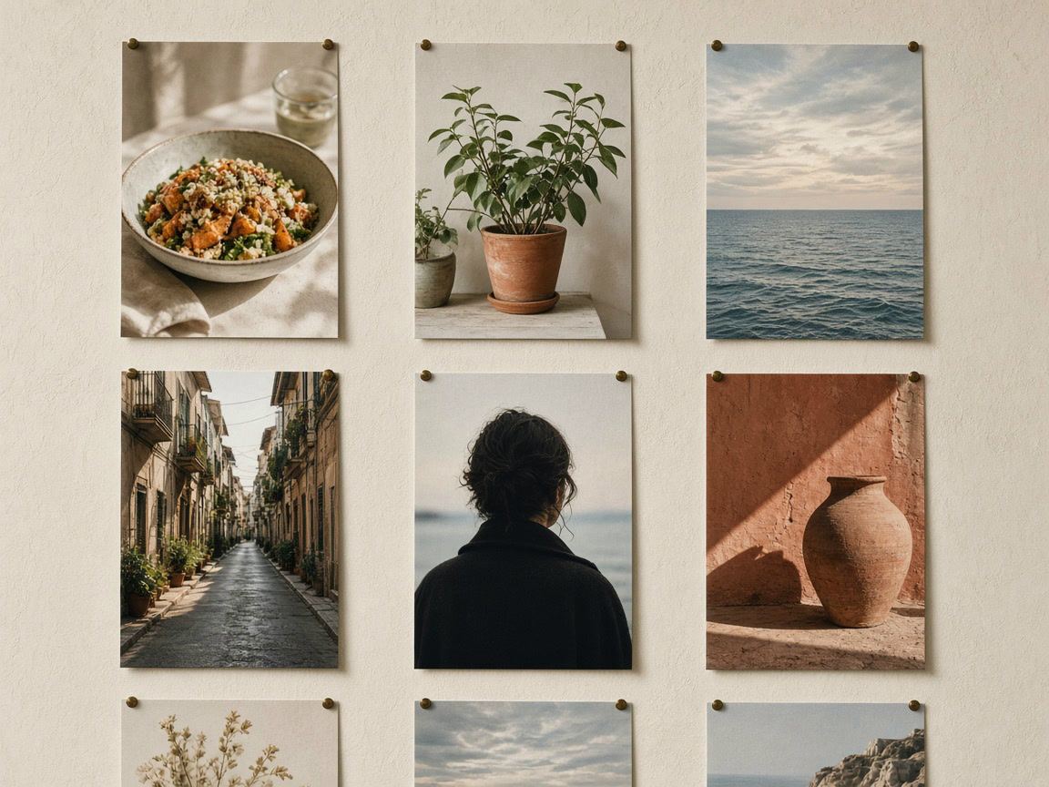
For posts you make from now on, there are two good choices:
Fills the tile exactly and uses the most screen space in the feed. Nothing is cropped anywhere. The natural choice for photos, quotes and graphics made for Instagram.
The long-standing portrait format, still fine. Keep text and faces at least 40 pixels away from the left and right edges, and the grid crop will never touch them.
Squares and landscapes still work in the feed, but plan for the crop: put the subject in the middle third of the width, or place the photo inside a 3:4 frame with a border or blurred background. Our guide to posting a full photo without cropping shows three ways to do that, and the image size guide lists the size for every format.
All the tools for this run in your browser, and your photos are not uploaded:
You do not need to delete and repost old content. Current versions of the Instagram app have an option in a post's menu, named Adjust preview in press reports, that lets you move the post inside its grid tile or fit the whole image with a plain background. It changes only the thumbnail on your profile; the post itself, its likes and its comments stay as they are. If you do not see the option, update the app.
Since June 8, 2026, you can also change the order of the grid. Instagram described the feature as "Reorder your grid": press and hold any post on your profile, choose Reorder grid and drag posts into place; changes are saved right away and visible to every visitor. Pinned posts stay at the top (Social Media Today (opens in a new tab), quoting Instagram, checked November 2026). That makes it much easier to repair a planned layout that the new tile shape broke.
A practical order for a cleanup: first adjust the previews of posts with text or faces near the edges, then the most recent row or two, because those are what visitors see without scrolling. Older rows matter less.
A grid where every post is 3:4, or every post is 4:5 with safe margins, looks calm. Mixed shapes are fine in the feed but make the grid uneven.
Keep headlines, logos and faces inside the middle of the image. On Reel covers, keep titles within the central 1080 × 1440 area, away from the top and bottom 240 pixels.
The grid shows the first slide of a carousel. Make that slide work as a thumbnail on its own, with the main subject or the title in the middle.
Put your next nine posts into the collage maker with the 3:4 canvas and the nine-photo grid layout. Each cell is then close to the shape of a profile tile, so you see the rows as visitors will.
The preview trick also helps with color. Three posts in a row with the same dominant color look intentional; one bright outlier in a muted row looks like a mistake. Our post on collage layouts has more ways to use the collage maker for planning.
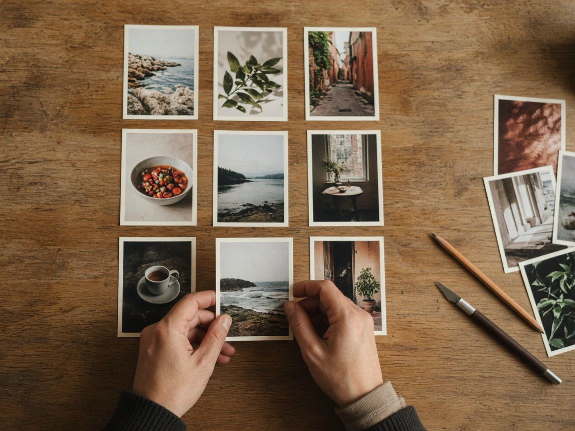
Some accounts cut one large picture into several posts so that the grid shows a single image across a row or across the whole screen. Those layouts were made for squares, and the switch to tall tiles broke most of them. If you want to build one now:
No. There is no setting for it. You can change how each post sits in its tile with the preview option in the post menu, but the tiles stay tall.
1080 × 1440 pixels, a 3:4 portrait, fills the grid tile exactly and is the tallest shape Instagram keeps in the feed. 1080 × 1350 also works if you keep important details away from the left and right edges.
No. Only the thumbnail on your profile is cropped. Anyone who opens the post sees it in the shape you uploaded.
A square is wider than the tall tile, so the grid shows only its middle three quarters. Adjust the preview to fit the whole square with a plain background, or post future squares inside a 3:4 frame.
Design
Thin borders, subtle light leaks and rounded corners that look current: simple rules for thickness, opacity, blend modes and a consistent style.
Design
Safe zones, text size, contrast and room for stickers: how to design story and post templates that work every time you reuse them.
Design
Icons, colors and names for highlight covers that look like one set and help visitors find what they came for.