
Editing
Photo editing basics: brightness, contrast, color and sharpness
Crop, light, contrast, color, sharpening: the order that makes edits easier to judge, and how far to take each slider.
A filter works best when it fits the light and the subject. Here is how to pick one for portraits, food and landscapes, and how strong to make it.
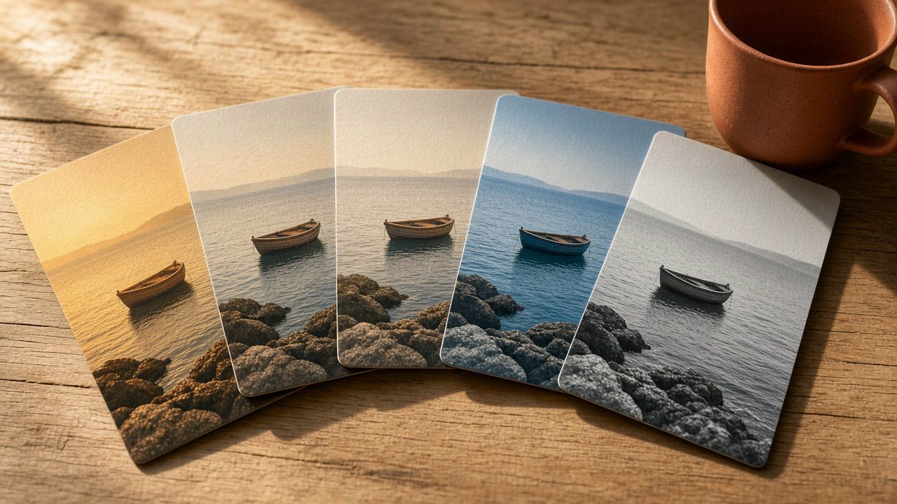
A filter is a recipe of color and tone changes applied in one tap: warmer midtones, softer blacks, a little more contrast, a shift toward blue in the shadows. It moves the colors that are already in the photo. That is why the same filter looks lovely on one picture and strange on the next: it starts from a different place each time.
It also explains what a filter cannot do. It cannot fix a photo that is far too dark or too bright, it cannot remove a heavy color cast on its own, and it cannot add detail that is not there. Fix exposure first, then choose the look. Our post on photo editing basics covers that order step by step; this article is about the second part, choosing the look and how strong to make it.
The examples below use the 36 presets in our editor, grouped as Warm, Cool, Soft, Vivid, Black & white and Vintage. They are our own looks, not Instagram's filters, but the advice works for any filter set, including the one in the Instagram app.
The light in a photo decides more than the subject does. Before you scroll through filters, look at where the picture was taken and what the light was doing.
| Light | What it does to the photo | Direction that usually works |
|---|---|---|
| Golden hour, sun low | Warm, orange, long soft shadows | Keep the warmth; a warm or soft look at low strength. Cooling it removes what made it beautiful. |
| Midday sun | Hard contrast, bright highlights, dark shadows | Lift the shadows first, then a soft or faded look rather than a punchy one. |
| Overcast day | Flat, gray, slightly cool | Add a little contrast and warmth; a vivid look at medium strength. |
| Indoor bulbs | Yellow or orange cast | Lower the warmth or choose a cool look; warm filters make it worse. |
| Window light | Soft and fairly neutral | Almost anything works; soft and bright looks shine here. |
| Night and neon | Mixed colors, noise in dark areas | A cool look, or black and white to calm mixed colors. Do not brighten much; noise grows. |
Skin is where filters fail first. Viewers know what skin looks like, so even a small shift toward orange, green or magenta looks wrong, while the same shift in a landscape goes unnoticed.
Warm and soft looks are the usual choice for portraits, such as Golden, Honey or Peach in our editor. Black and white is the other safe option: without color, there is no color cast to get wrong.
Food looks best a little warm and a little richer than life, never more. The common mistakes are pushing saturation until greens turn neon and reds turn flat, and using cool looks that make dishes look cold and old.

Landscapes accept stronger looks than people or food. Nobody knows exactly how blue the sky was that day, and mood matters more than accuracy.
Strength is the most underrated setting. The same look at 30 percent and at 100 percent can be the difference between "nice light" and "obviously edited". Here are the starting points we use. They are rules of thumb, not data, so trust your eyes.
| Subject | Starting strength | Why |
|---|---|---|
| Products for a shop | 0 to 30 percent | Customers expect the item to look like the photo |
| Portraits and selfies | 30 to 50 percent | Skin shows color shifts first |
| Food | 40 to 60 percent | Warmth helps, too much saturation hurts |
| Landscapes and travel | 50 to 80 percent | Mood matters more than accuracy |
| Street, architecture, art | 60 to 100 percent | A strong, graphic look can be the point |
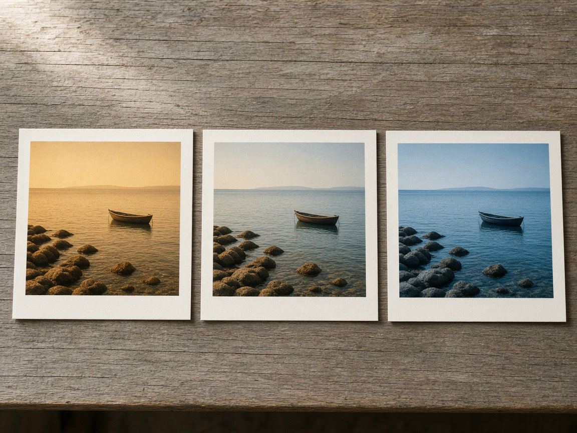
A strong look is not wrong; it just has to be a choice. Black and white at full strength, a heavy vintage fade or a deep cool tone can define an account. What rarely works is a strong look picked by habit for every kind of photo.
Accounts with a recognizable style usually stick to one or two looks at similar strength. To do that without effort:
The Instagram app has its own filter strength slider (Instagram Help Center (opens in a new tab), checked November 2026), and before posting you can tap and hold the photo to see the original (Instagram Help Center (opens in a new tab), checked November 2026). If you have already edited the photo elsewhere, leave the app's filter on Normal so the two looks do not stack. To try all 36 of our looks on your own photo, open photo filters; the photo stays on your device. And when several photos go into one image, our collage ideas show how one look ties them together.
There is no single best one, but warm and soft looks at low strength flatter most faces. Check a white or gray area in the photo: if it stays neutral, the skin will look natural too.
Using one or two looks at a similar strength gives a feed a recognizable style. Adjust exposure for each photo first, so the look comes out the same.
Instagram scales photos to at most 1080 pixels wide, and every phone screen shows color a little differently. Export at 1080 pixels wide so the photo is not resized again, and if color matters, check it on a second phone before you post.
Editing
Crop, light, contrast, color, sharpening: the order that makes edits easier to judge, and how far to take each slider.

Video
Ratios, sizes and lengths for feed, Stories and Reels video ads, the safe zones in pixels, and how to make the first seconds count.

Growth
A section-by-section checklist for any Instagram profile: header, highlights, grid, captions, hashtags and activity, plus what to fix first.