Design
Frames, borders, overlays and rounded corners without looking dated
Thin borders, subtle light leaks and rounded corners that look current: simple rules for thickness, opacity, blend modes and a consistent style.
Ten layouts worth using, what each one is good for, and how to make photos from different moments look like one picture.

A good collage answers one question: why do these photos belong in one picture? A before and after only makes sense side by side. A recipe makes sense in order. A trip makes sense as one big view and a few details. When the photos tell one story together, a collage works. When they are simply your best shots of the week, a carousel usually does the job better, because each photo stays large.
Instagram lets you post up to 20 photos and videos as one carousel, but all of them share one orientation: square, portrait or landscape (Instagram Help Center (opens in a new tab), checked November 2026). A collage has no such limit inside it. A tall portrait and a wide landscape can sit next to each other in one image, which is often the real reason to make one.
Below are ten layouts we find useful, six for feed posts and four for stories, with the photo count, the canvas shape and what to watch out for. All of them can be made in our free collage maker, which runs in your browser and does not upload your photos.
For the feed, use a portrait canvas, 4:5 (1080×1350) or 3:4 (1080×1440), or a square one. Portrait canvases take up more of the screen, which gives every cell more room.
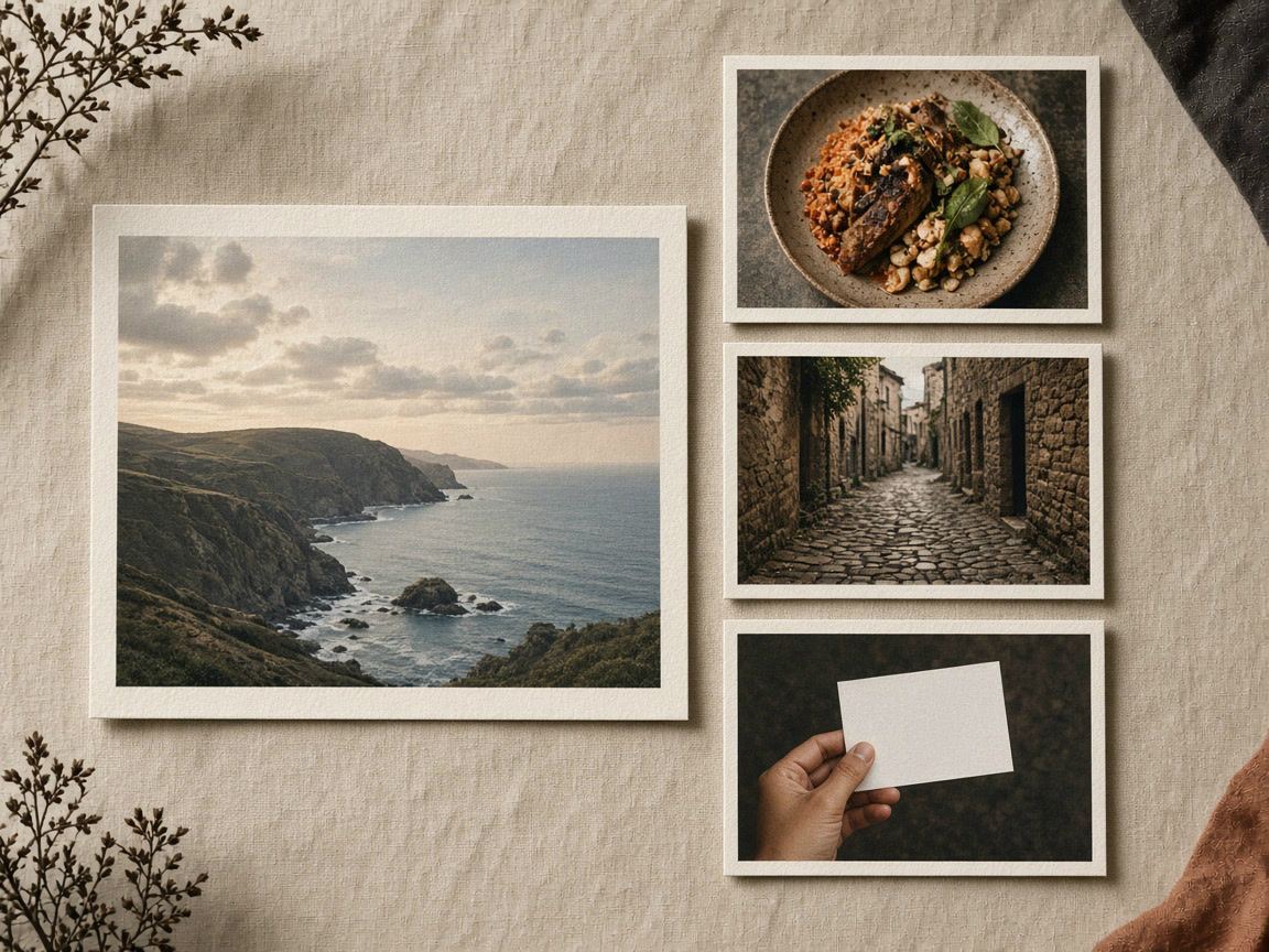
Four photos in a mosaic: one large cell for the widest view, three small ones for details such as food, a street or a ticket in your hand. Put the landscape photo in the big cell; details survive small cells better than views do.
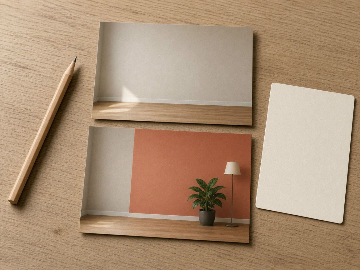
Two photos in a strip. Stack them when the subject is wide (a room, a garden): on a 4:5 canvas each half is about 1080×675. Put them side by side when it is tall (a haircut, an outfit). Shoot both from the same spot and height.
Four or six photos in an even grid, in cooking order from left to right and top to bottom. Keep the same angle and the same plate or board in every shot, so the eye follows the food, not the background.
Three photos: one hero shot in a large cell, two close-ups of texture, stitching or packaging in small ones. It answers questions that a single product photo cannot.
Single-photo layouts such as the instant-print frame, an arch, a circle or a split with space for text. Good for quotes, announcements and dates, where the text needs a calm place next to the picture.
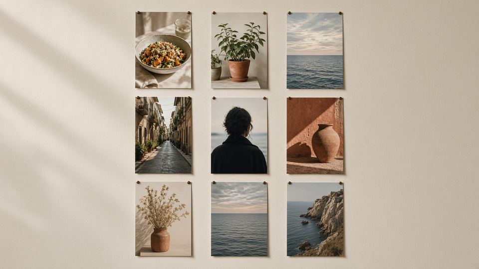
Nine photos in a 3×3 grid. On a 4:5 canvas each cell is only 360×450 pixels, about a third of a phone screen wide, so choose it for color and mood, not detail.
Stories use the tall 9:16 canvas (1080×1920). Instagram places its own controls over the top and bottom of a story, so keep faces and text away from both edges. In our own story templates we keep important text between 250 and 1600 pixels from the top for that reason; it is a sensible guide for collages too. Our post on story design covers safe zones in more detail.
Two photos stacked, each almost square at about 1080×960. Leave a little spacing between them and add Instagram's poll sticker over the gap in the app.
Three tall strips side by side, each about 360×1920. That narrow shape suits full-length photos and nothing else, which is why it works so well for outfits.
One or two photos plus a block of plain background for the date and place. Add the text in the collage maker, or leave the space empty and use Instagram's text tool.
Five to seven photos in a mosaic with one large cell at the top. Put the photo that best sums up the week in the big cell, because it is the one people notice first.
The number of photos narrows the choice quickly. The table shows how many layouts our collage maker offers for each count and what each count is best at.
| Photos | Layouts in our tool | Works best for |
|---|---|---|
| 1 | 7 | Quotes, announcements, an instant-print or arch look |
| 2 | 9 | Before and after, this or that, two people or two places |
| 3 | 9 | Product and details, outfits, a three-part sequence |
| 4 | 11 | Trips, recipes, events: the most flexible count |
| 5 or 6 | 6 and 5 | Weekly recaps, mosaics with one hero photo |
| 7 to 9 | 3, 4 and 4 | Photo dumps and mood boards; better in stories than in the feed |
As a rule of thumb, two to four photos is the sweet spot for a feed post. Beyond that, each cell gets too small to read on a phone, and a carousel or a story usually serves the photos better.
Photos from one day can still look like they come from three different cameras: one warm from indoor light, one cool from the shade, one bright from the window. In a collage these differences jump out, because the photos sit right next to each other. Four settings fix most of it.
Pick two to four that tell one story, including one strong photo that can carry the large cell.
4:5 for the feed, 9:16 for stories. The layout list then filters to your photo count.
Drag photos between cells to swap them, then drag inside each cell to frame faces and details.
Apply one quick filter to all cells, check the spacing, and save a JPG at 1080 pixels wide, or 2160 pixels if you also want to print it.
If a single wide photo is all you have, a collage is not the answer; post it whole with a blurred background instead, as explained in posting a full photo without cropping.
For a feed post, two to four is a good rule of thumb, because each cell stays large enough to see on a phone. Stories can take more, up to six or seven, thanks to the tall canvas.
Yes. A common approach is a collage as the first slide, followed by the full photos. Keep the same shape for every slide, because a carousel uses one orientation for all of them.
1080 × 1920 pixels, the 9:16 story shape. Keep faces and text away from the top and bottom edges, where Instagram shows its own controls.
Design
Thin borders, subtle light leaks and rounded corners that look current: simple rules for thickness, opacity, blend modes and a consistent style.
Design
Safe zones, text size, contrast and room for stickers: how to design story and post templates that work every time you reuse them.
Design
The profile grid switched to tall tiles in January 2025. What gets cropped, the size to post, and how to plan a grid that looks right.