Editing
Choosing the right filter for your Instagram photo
Pick a filter by light and subject, set the strength for skin, food and landscapes, and keep a feed consistent.
A simple order for editing any photo, what each step fixes, and starting values for the sliders, with a worked example.
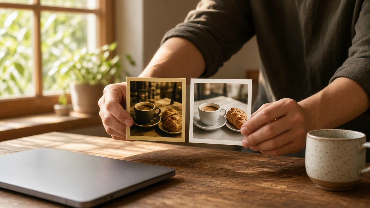
Most photo edits use the same four controls: brightness, contrast, saturation and sharpening. Each one changes how the others look. Raise contrast and colors look stronger; brighten a photo and it looks less colorful; sharpen before you know the final size and you may sharpen the wrong amount. Working in a fixed order means you judge each step on a picture that is already right in the ways that came before.
The order we use is simple: crop, light, contrast, color, sharpening, export. It follows what you look at first in a photo. Shape and framing come before everything, light decides whether the subject can be seen, contrast decides how the light feels, color comes once the tones are settled, and sharpening is a finishing step for the final size.
In our editor nothing is baked in along the way. Every slider stays adjustable until you download, and the export is rendered once from the original pixels, so going back to change brightness after sharpening costs nothing. The order is about judging well, not about avoiding damage.
Cropping changes what is in the picture, and with it what needs fixing. A bright window cut out of the frame no longer needs its highlights pulled down; a tilted horizon distracts more than any color problem. Crop to the shape you will post, straighten the horizon, then start on the light. For the shapes Instagram keeps, see the image size guide and our post on the 3:4 profile grid.
Ask one question: can you see the subject clearly? If the whole photo is too dark or too bright, use the brightness tool. If only part of it is the problem, the Shadows and Highlights sliders in the same panel are better, because they leave the rest of the picture alone.
Stop before anything white turns flat white with no detail. Once that detail is gone, no other slider brings it back.
Brightening lifts the dark tones, so a photo often looks gray and flat after step 2. Contrast pushes darks and lights apart again. Use the contrast tool and watch the darkest and lightest parts of the picture rather than the middle.
Not every photo needs more. Harsh midday sun already has too much contrast; there the right move is to lower it and lift the shadows. A soft, misty morning can stay soft on purpose. Contrast is also the step where a picture starts to look "edited", so this is the slider to be most careful with on portraits.
Color has two separate jobs, and the order between them matters.
Skin is the easiest test. If faces start to look orange or red, go back. Remember too that contrast from step 3 already made colors look a little stronger, so you often need less saturation than you expect.
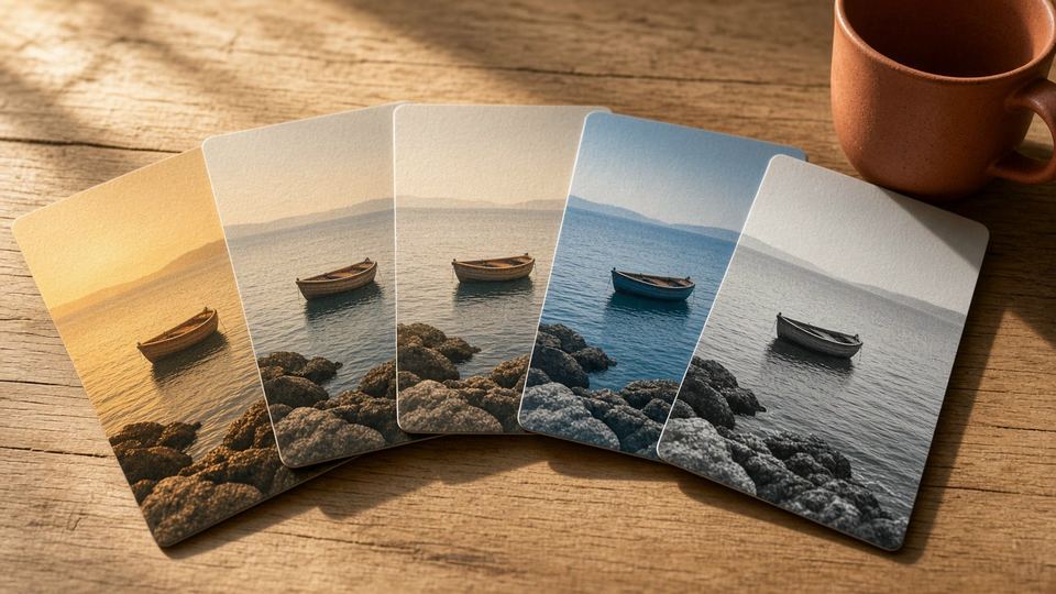
If you want a filter or a particular look, apply it after this step, on a photo that is already balanced. Our post on choosing a filter covers which looks suit which photos, and why a subtle strength often works better.
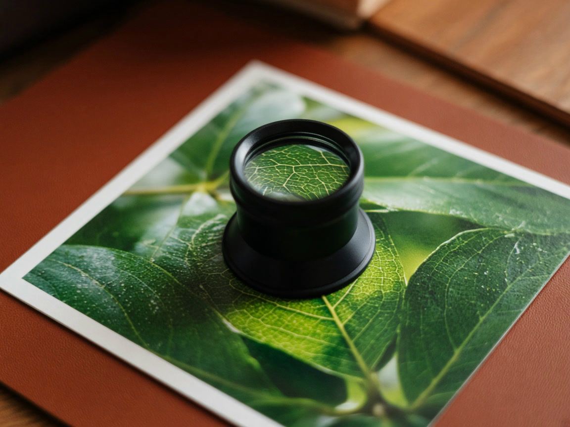
Sharpening makes fine edges crisper: eyelashes, text, leaves, fabric. It is a finishing step because it depends on the size of the final picture. Instagram shows photos at up to 1080 pixels wide and scales larger photos down to that width (Instagram Help Center (opens in a new tab), checked November 2026), and scaling softens edges a little.
Use the sharpen tool at 100% zoom on an area with fine detail, such as the eyes. Raise it slowly and stop when the detail looks crisp; if light outlines appear along dark edges, go back. In our editor the sharpening is scaled to the size you export, so the download looks like the preview whichever size you choose.
Every photo starts differently, so there are no correct numbers. The ranges below are our own starting points for the sliders in our editor, which run from −100 to 100 (Sharpen from 0 to 100). They are not rules, and a good edit often uses less.
| Slider | Typical starting range | Go further when |
|---|---|---|
| Brightness | −15 to +20 | The photo is clearly too dark or too bright overall |
| Shadows / Highlights | +10 to +40 / −10 to −40 | Strong backlight or a bright sky |
| Contrast | −15 to +20 | Haze or fog (more), harsh sun (less) |
| Vibrance / Saturation | +5 to +25 / −10 to +15 | Landscapes and flowers; rarely for portraits |
| Sharpen | 10 to 30 | Products, architecture, text; less for faces |
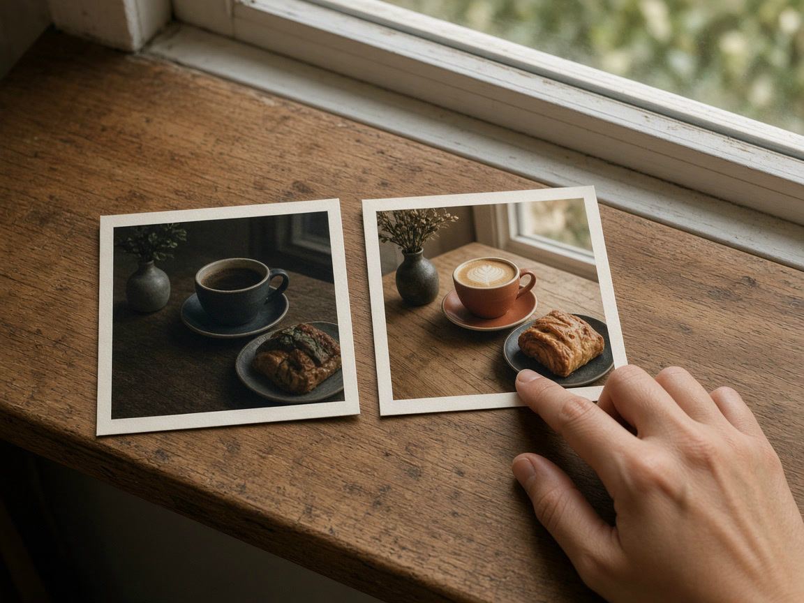
A worked example: a photo of a coffee and a pastry by a window, taken in the evening under a warm lamp. The window is too bright, the table is dark and everything looks yellow. One reasonable edit:
Those are the values for this one imaginary photo, not a preset. Hold the compare button after each step: if you cannot say what got better, undo it.
Both work. Editing before uploading gives you a bigger preview, a compare view and an edited copy that stays on your device, which helps if you post the same photo elsewhere.
Not quite. Exposure changes all tones together, like more light reaching the camera. Brightness works mostly on the midtones and protects the deepest blacks and brightest whites.
Instagram recompresses uploads and scales photos wider than 1080 pixels down. Screens also differ. Avoid extreme values and export at 1080 pixels wide.
No. The editor runs in your browser, so the photo stays on your device.
Editing
Pick a filter by light and subject, set the strength for skin, food and landscapes, and keep a feed consistent.

Video
Ratios, sizes and lengths for feed, Stories and Reels video ads, the safe zones in pixels, and how to make the first seconds count.
Growth
A section-by-section checklist for any Instagram profile: header, highlights, grid, captions, hashtags and activity, plus what to fix first.